The Traffic Overview dashboard in the Traffic & Market Toolkit gives you a comprehensive snapshot of any domain’s website traffic. With just a few clicks, you can understand how a site performs over time, what sources drive its visitors, and how engaged those users are.
Whether you're benchmarking a competitor, researching a partner, or tracking your own site, this dashboard delivers clear, easy-to-read traffic insights in a single place.
Getting started with the Traffic Overview dashboard
The Get Started menu is your entry point into the Semrush Traffic & Market Toolkit. It’s designed to help you quickly enter domains and move into your analysis of their traffic and marketing performance.
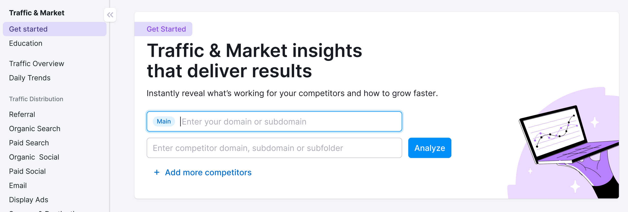
You’ll use this page to kick off your analysis—it’s your launchpad into the entire Traffic & Market experience.
If you haven’t created any projects yet, you’ll see a search panel where you can:
- Type in a domain — Start by entering the main domain you’d like to analyze
- Add additional competitors — Use the “+ Add more competitors” link to compare multiple sites at once
- Click the “Analyze” button — This will pull up dashboards with data and charts, starting with the Traffic Overview dashboard
If you’ve already entered domains into the toolkit, you’ll see them saved as “Folders” and you can access them anytime.
In this case, you’ll see your saved folders listed on the Get Started screen. Click any one of them to jump straight into your dashboards and pick up right where you left off.
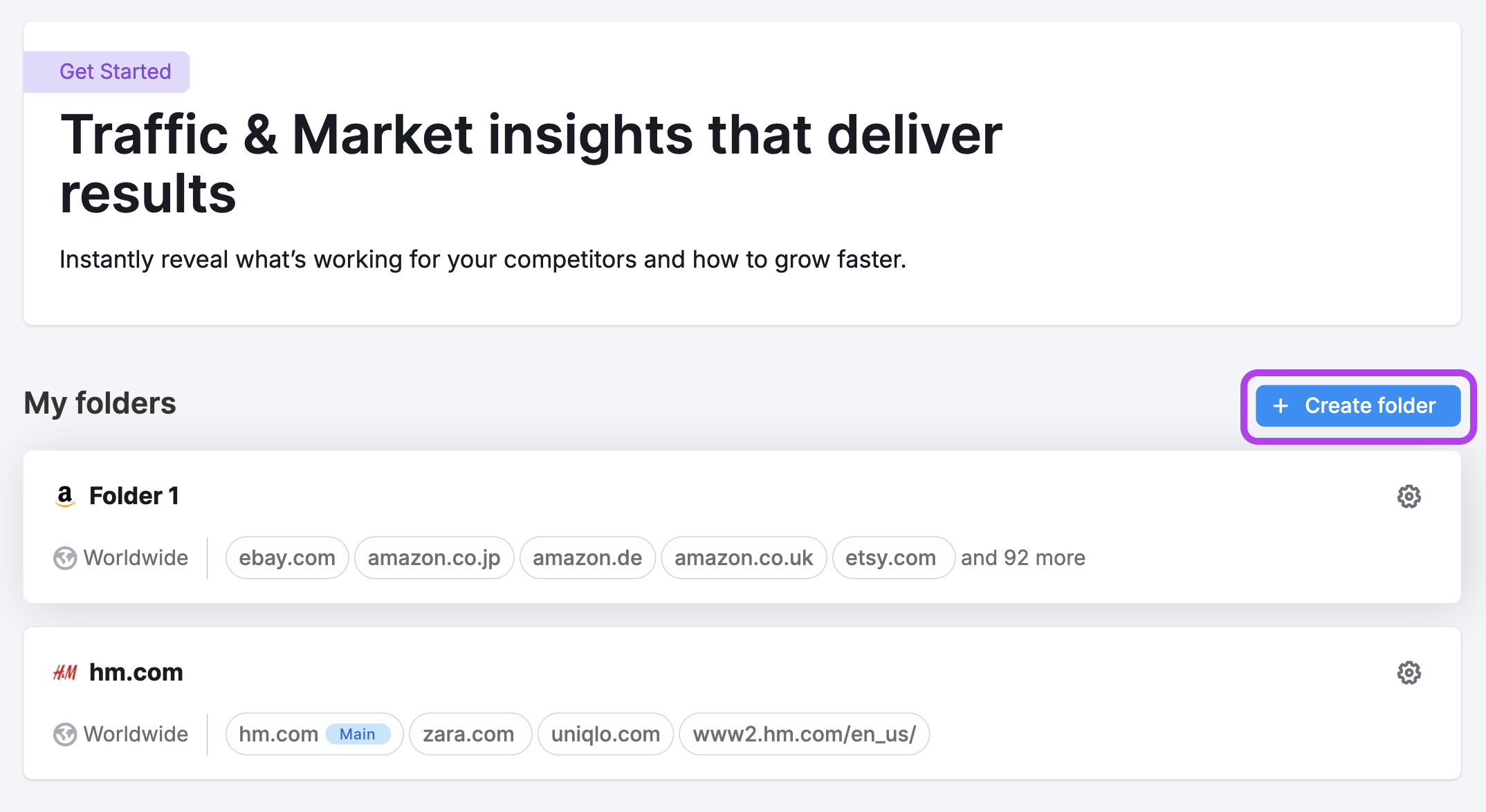
Use the “Create Folder” button to start a new project whenever you're analyzing a new domain or market.
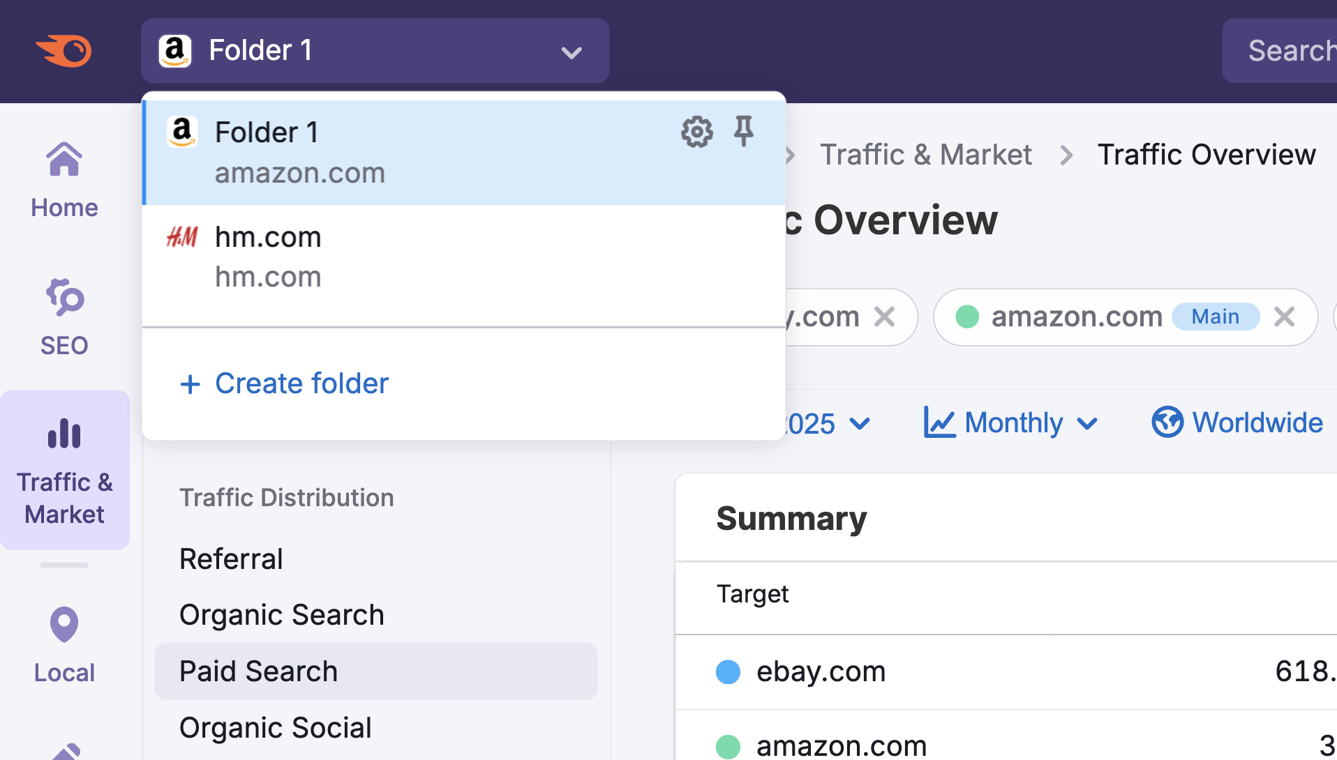
Note: At any time inside any dashboard, you can select the Competitor list drop-down in the upper left to edit your current list or create a different one without losing your place.
Traffic Overview dashboard key features
The dashboard is organized into visual widgets that tell a clear story about web performance, traffic sources, and user behavior.
Note: At any time, you can adjust the date range, switch between daily, weekly, or monthly data, select a device type, and filter by location using the controls at the top of the dashboard.

Summary Metrics
See high-level performance stats for the domain:
- Visits – total visits over time
- Unique Visitors – how many distinct users visited the site
- Pages per Visit – average number of pages viewed
- Avg. Visit Duration – time spent per session
- Bounce Rate – percentage of sessions with no interaction
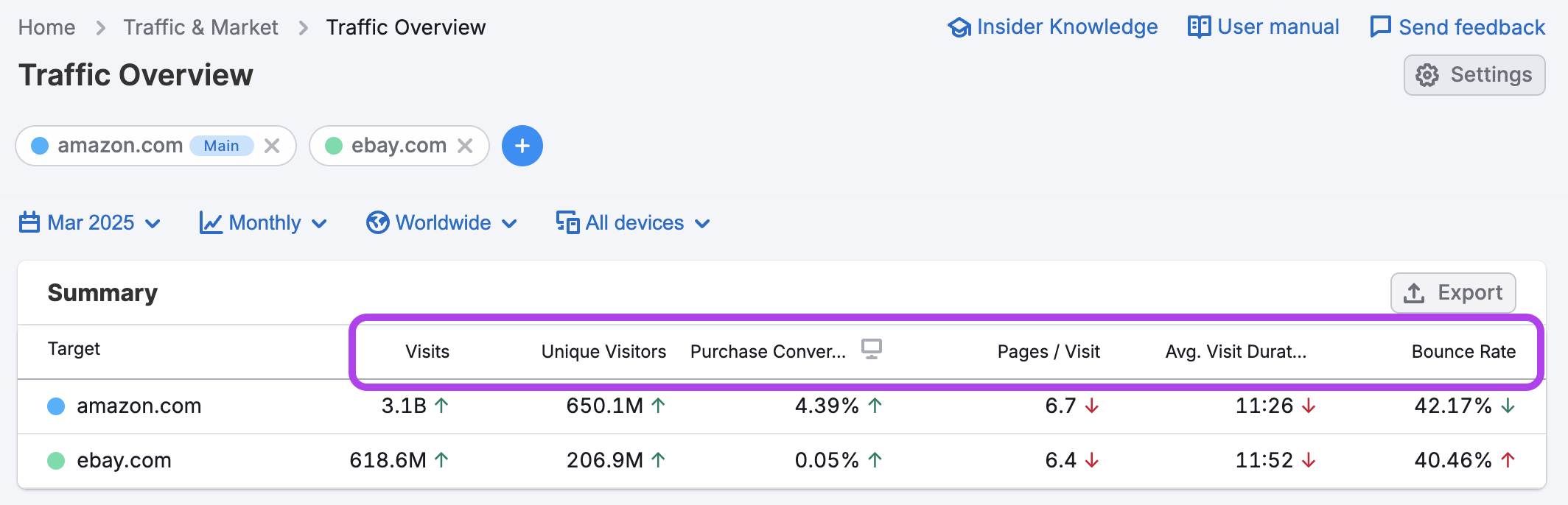
This data can help you benchmark engagement, spot performance issues, and understand how users interact with a site at a glance.
Traffic Trend
The Traffic Trend graph shows how a domain’s traffic and engagement metrics evolve over time. You can toggle between key indicators—like Visits, Unique Visitors, Purchase Conversion, Pages per Visit, Average Visit Duration, and Bounce Rate.
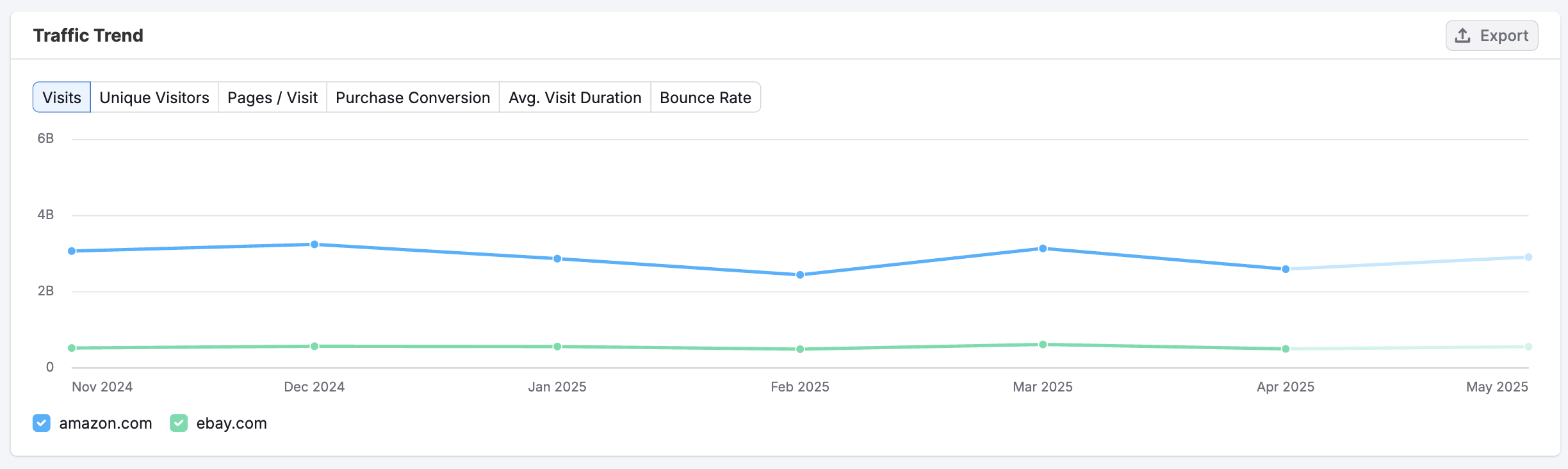
Compare multiple domains to see who’s growing, who’s declining, and how trends unfold over time. It's ideal for monitoring momentum, evaluating the impact of campaigns, or identifying long-term shifts in user behavior.
Traffic Channel Distribution
The Traffic Channel Distribution chart shows the share of a domain’s traffic by channel. It helps you understand where most of the site’s visitors are coming from:
- Direct – Traffic from users typing in the URL or using bookmarks
- Referral – Traffic from links on external websites
- Organic Search – Visits from search engines without paid ads
- Paid Search – Traffic from search ads like Google Ads
- Organic Social – Visits from unpaid social media posts
- Paid Social – Visits from social media ads
- Email – Traffic from email campaigns
- Display Ads – Traffic from banner or display advertising
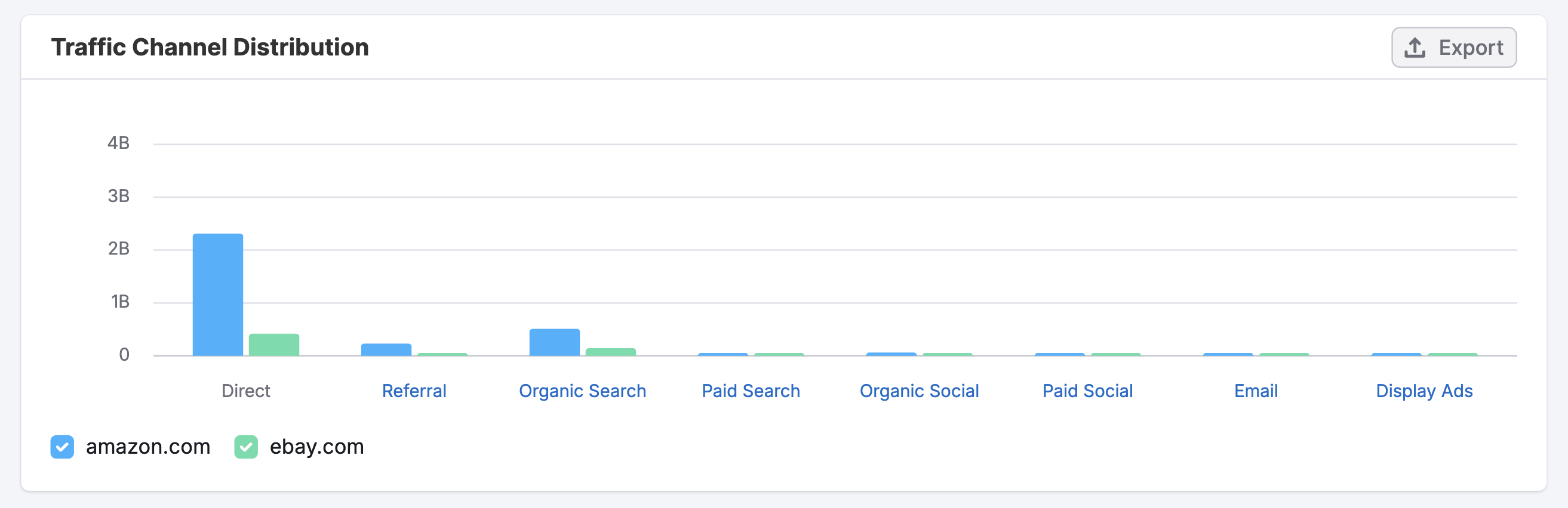
Use this chart to quickly assess a competitor’s marketing focus, identify over- or underutilized channels, and spot opportunities to shift or balance your own traffic mix.
Traffic Channel Trend
This line graph tracks how traffic from each source changes over time. Select channels using the check-boxes below the chart to view specific channels like Referral, Organic Search, Paid Social, or Email to see where gains or losses are happening month by month.
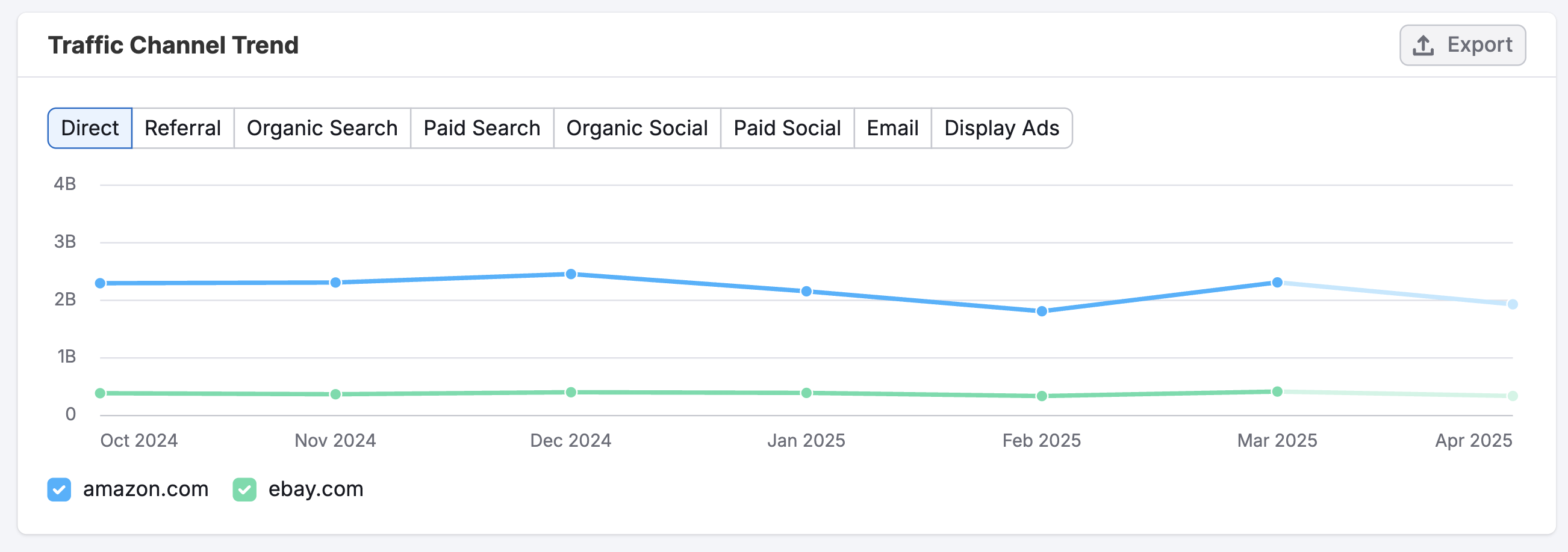
It’s ideal for monitoring shifts in strategy, evaluating campaign timing, or benchmarking channel performance across competitors.
Traffic Journey
This flowchart shows where users came from before visiting the domain—and where they went after leaving.
- Sources – where users came from before landing on the domain
- Destinations – where they go after leaving
On the left, you'll see top sources like Direct traffic, Google Organic, or individual domains sending traffic. On the right, you’ll see top destinations like partner sites or search engines.

Use this view to understand how a site fits into the broader web journey, uncover potential partnerships, or identify indirect competition.
Geo Distribution
This widget shows where a domain’s visitors are located. It combines a world map with a country-by-country breakdown of visits, engagement, and device usage.
You can toggle between Visits and Unique Visitors to assess market size, or switch to desktop/mobile views to evaluate device trends.
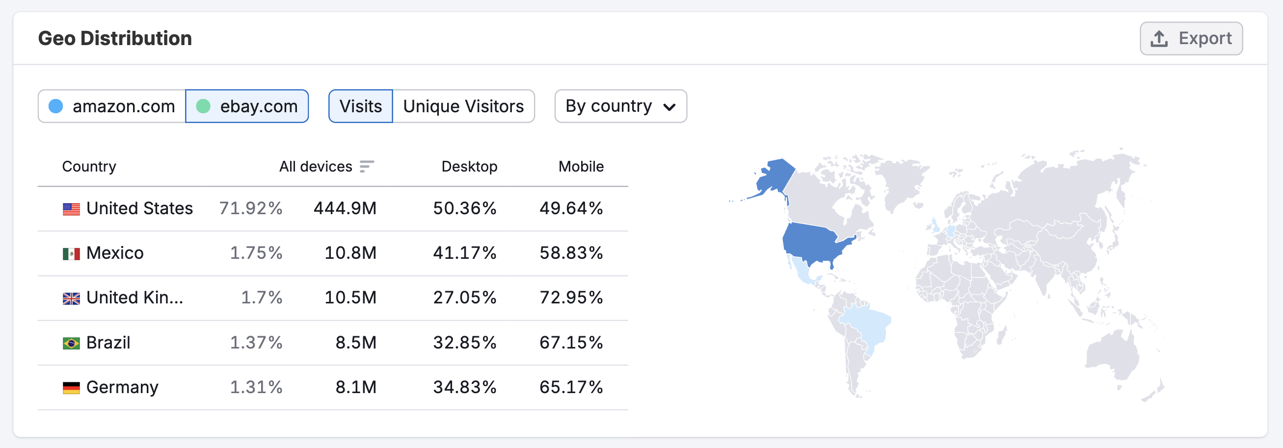
Use this data to pinpoint key markets, localize campaigns, and explore expansion opportunities.
How can I act on the insights found in these dashboards?
The Traffic Overview dashboard helps you understand the big picture of a domain’s performance—making it easier to identify trends, benchmark competitors, and prioritize the next move. Here’s how you can use the data to take meaningful action:
- Evaluate overall performance at a glance
Use summary metrics like Visits, Unique Visitors, and Bounce Rate to gauge how well a site is attracting and engaging its audience. A sudden drop in average visit duration or a spike in bounce rate could signal a user experience issue—or reveal an underperforming campaign. - Benchmark against top competitors
Compare multiple domains side by side to see who’s gaining traffic, which channels are leading, and how engagement stacks up. These insights help you set realistic performance goals and identify gaps in your own strategy. - Uncover strengths and weaknesses in the channel mix
With the Traffic Channel Distribution chart, you can spot whether a domain is overly reliant on one source—like Direct or Organic Search—or if it’s balancing efforts across Paid Social, Display, or Email. Use this to guide your media planning or strengthen underused channels. - Track long-term trends and momentum
Use the Traffic Trend graph to visualize month-over-month changes in key metrics. It’s ideal for understanding the impact of SEO work, paid investments, or brand-building efforts over time. - Understand user flow and traffic partnerships
The Traffic Journey flowchart shows where users came from and where they went next. If you’re seeing strong referral traffic from a specific site—or noticing a competitor regularly sending users to a key partner—you might explore similar partnerships or optimize your link-building strategy. - Identify top markets and growth regions
The Geo Distribution widget helps you spot where a domain’s audience is strongest. Use this data to localize your campaigns, enter new markets, or compare engagement by region to find where your brand has room to grow.
By regularly checking the Traffic Overview dashboard, you can stay grounded in the data that matters most—so you’re not just reacting to trends but actively shaping them.
Where does Semrush traffic data come from?
Traffic Analytics reports are based on petabytes of clickstream data that comes from multiple proprietary and 3rd party data sources, Semrush’s proprietary AI and machine learning algorithms, and Big Data technologies. The data is accumulated and approximated from the user behavior of over 200 million real internet users, and over a hundred different apps and browser extensions are used to collect it.
For more information about how Semrush turns traffic data into traffic intelligence, refer to our article here.
As Traffic Analytics data is not obtained from any website’s internal analytics, the numbers you see here might differ from what you see in your Google Analytics or similar trackers you use. However, if you want to analyze only your own website traffic without comparing it with others, we recommend that you refer to your own Google Analytics.
All numbers in Semrush Traffic Analytics are perfectly comparable, meaning you can match two or more websites in the tool and see how their metrics differ from each other in %.
Limits
Access to the Traffic Overview dashboard depends on your subscription level. Here's a breakdown of the key differences between the Free and Pro plans:
Free Plan
You can only view data for sample domains. Real domain analysis and competitor comparisons are not available.
Traffic & Market Pro
Includes full access to real domain data and all features listed on the pricing page:
- 1 user seat
- Maximum of 3,000 requests per day
Traffic & Market Custom Plan
Designed for organizations that need custom solutions and team access:
- Custom team pricing
- API access
For all paid plans, historical data, channel breakdowns, traffic journey insights, and geo data are fully accessible. Free users will need to upgrade to analyze custom domains.
What related Traffic & Market dashboards should I use?
To expand your analysis, pair the Traffic Overview dashboard with:
Daily Trends – To track short-term changes in traffic, engagement, and specific channels on a daily level
Channel-Specific dashboards – Like Organic Search or Paid Social for detailed trends, sources, and top-performing pages
Sources & Destinations – To visualize where users came from and where they went next, helping identify referral partners or exit paths
Demographics – To segment traffic by country, state, region, age, gender, and device usage
Top Pages – To analyze the site’s content structure and identify which areas drive the most visits
Market Overview – To benchmark domain performance against competitors and see overall market trends and share
Audience Overlap – To compare audience intersections between multiple domains and spot shared or unique reach